about.
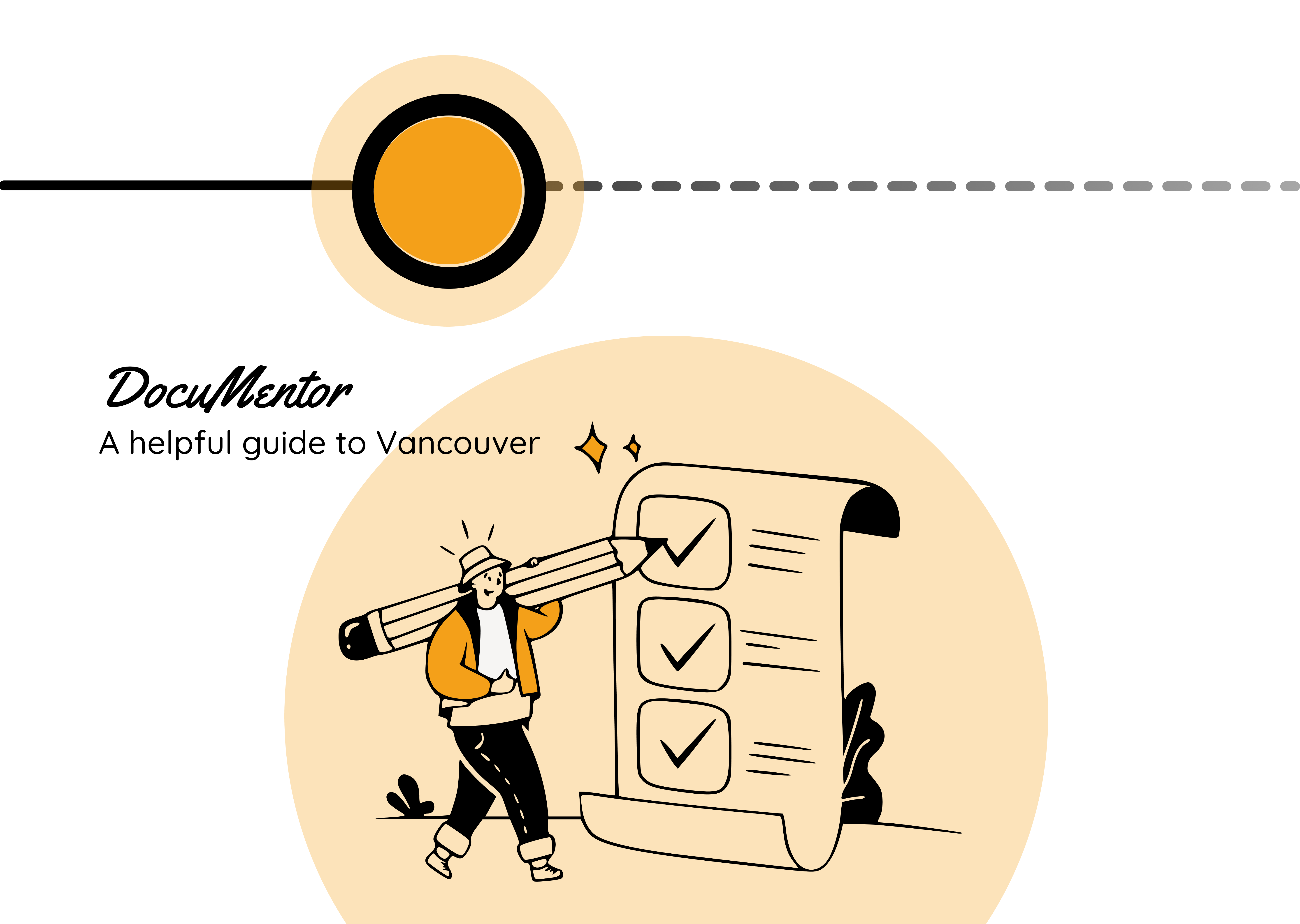
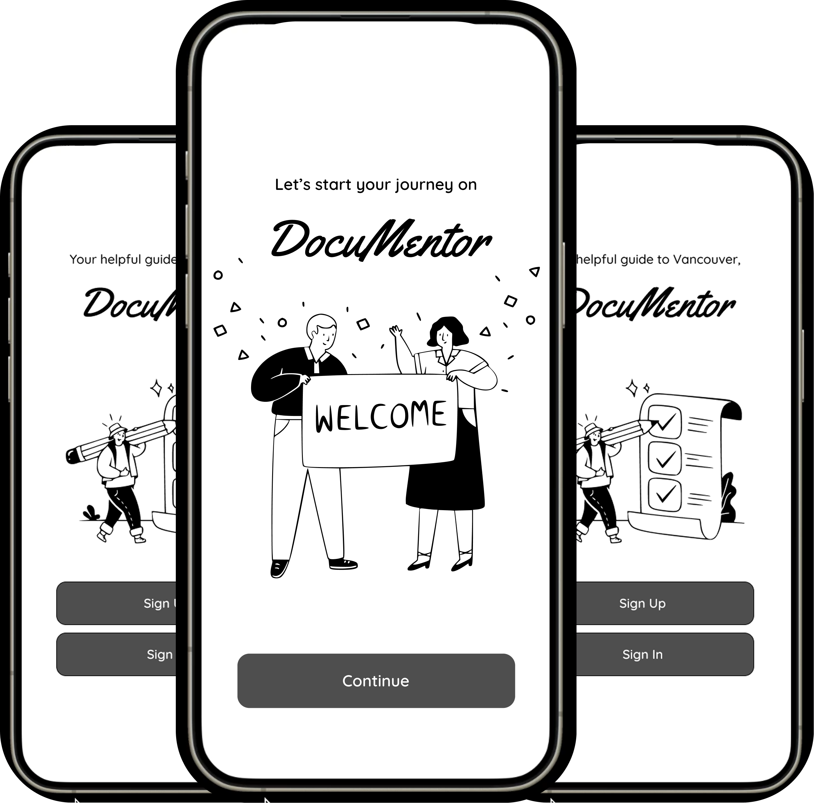
DocuMentor is an all-in-one app guide for international students.
A comprehensive mobile application designed to help international students navigate studying abroad essentials.
DocuMentor is an all-in-one app guide for international students.
A comprehensive mobile application designed to help international students navigate studying abroad essentials.
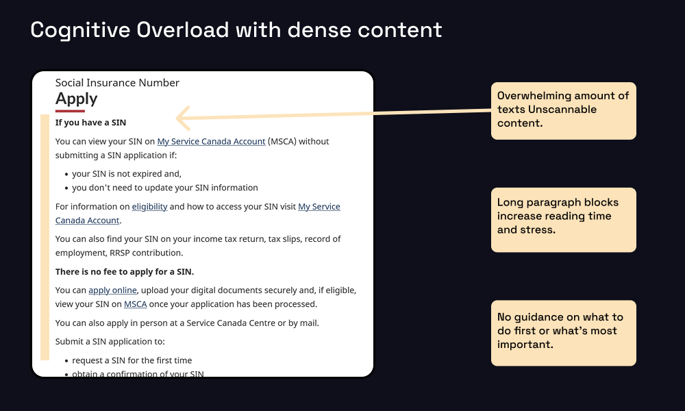
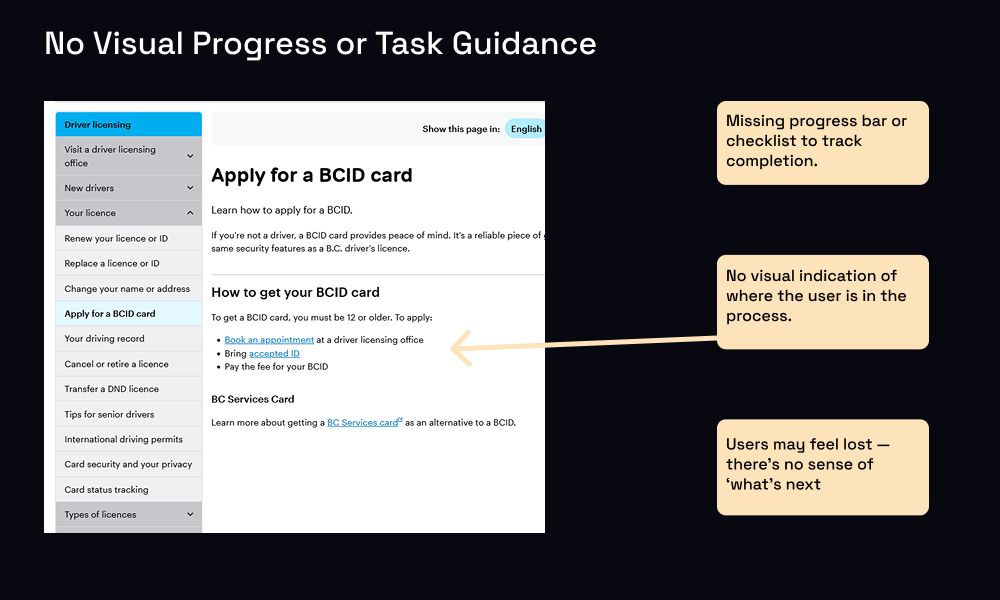
Cognitive overload prevents progress.
As an international student myself, I experienced how dense government websites turned simple tasks into stressful, error-prone processes. This first-hand frustration shaped the way I defined our design challenge: reducing cognitive overload and helping students feel more confident as they navigate important steps.
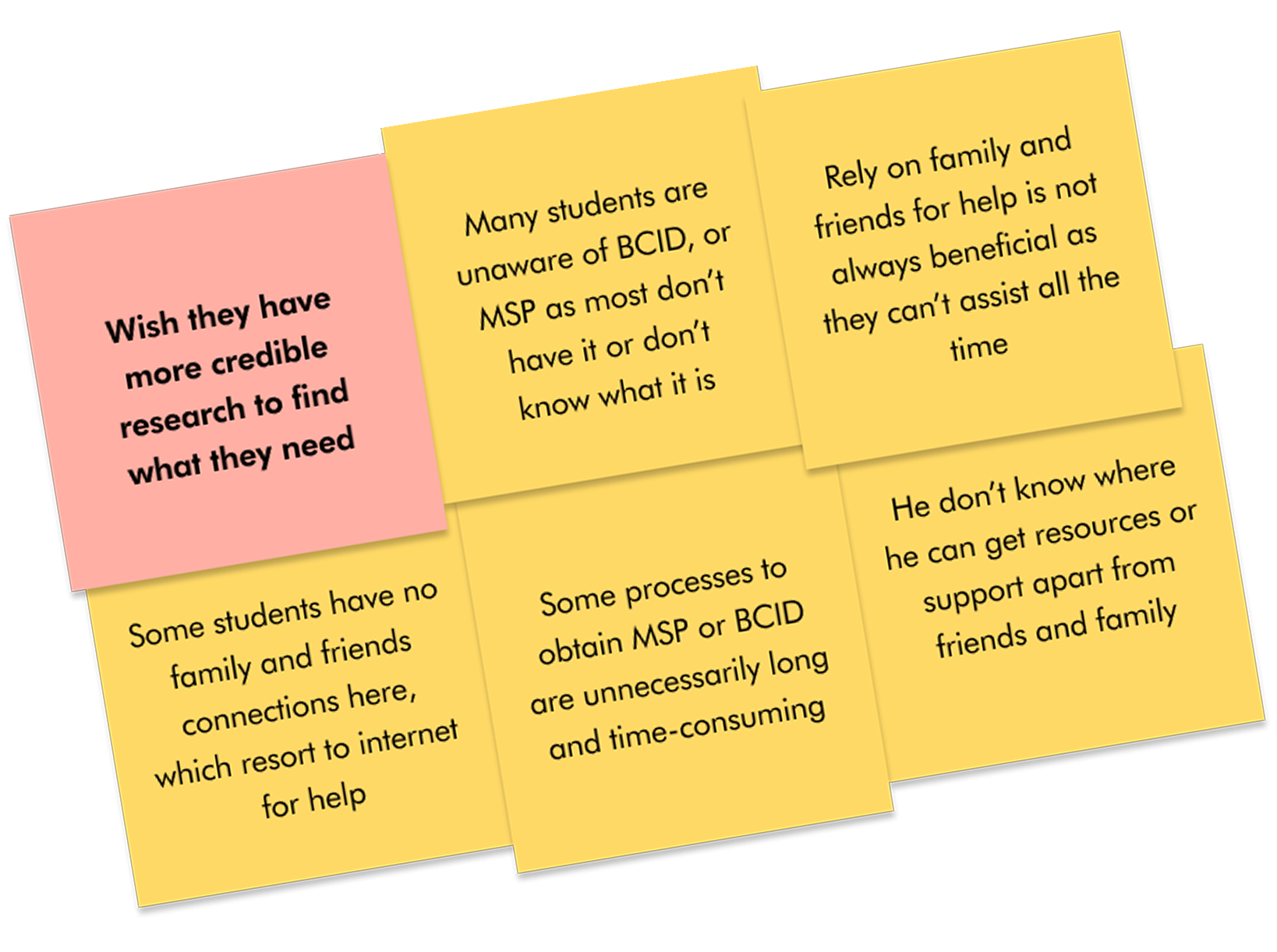
45 interviews across 12+ countries revealed key pain points.
Information overload, unclear progress, and complex navigation.
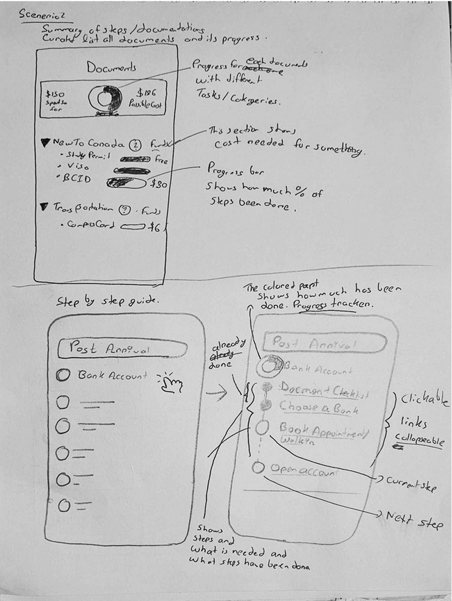
From sketches to solutions.
I came up with the idea of using rapid sketching and iteration to explore solutions and set the direction for what we should build. Through this process, I finalized the design around two core concepts: breaking tasks into micro-steps and visual progress tracking. Kate supported by refining the UI details, ensuring the final design was both functional and visually polished.
I created the first round of rapid sketches to explore directions and set the foundation for the design.
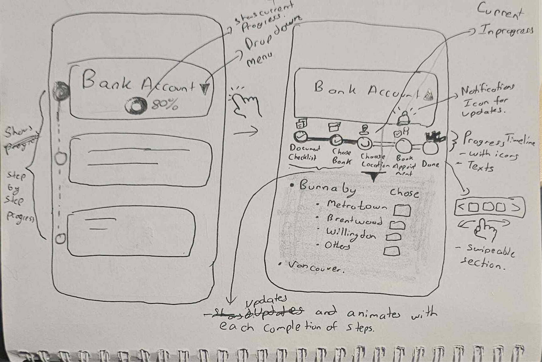
As the design evolved, I translated sketches into wireframes. Here I defined structure and interaction flow.
At this stage, we worked as a team to refine ideas. Kate took the lead on UI design and visual refinement, while I focused on maintaining clarity in the UX flow.
The final screens combined my focus on micro-step UX structure with Kate’s refined UI details, resulting in a balanced, functional design.
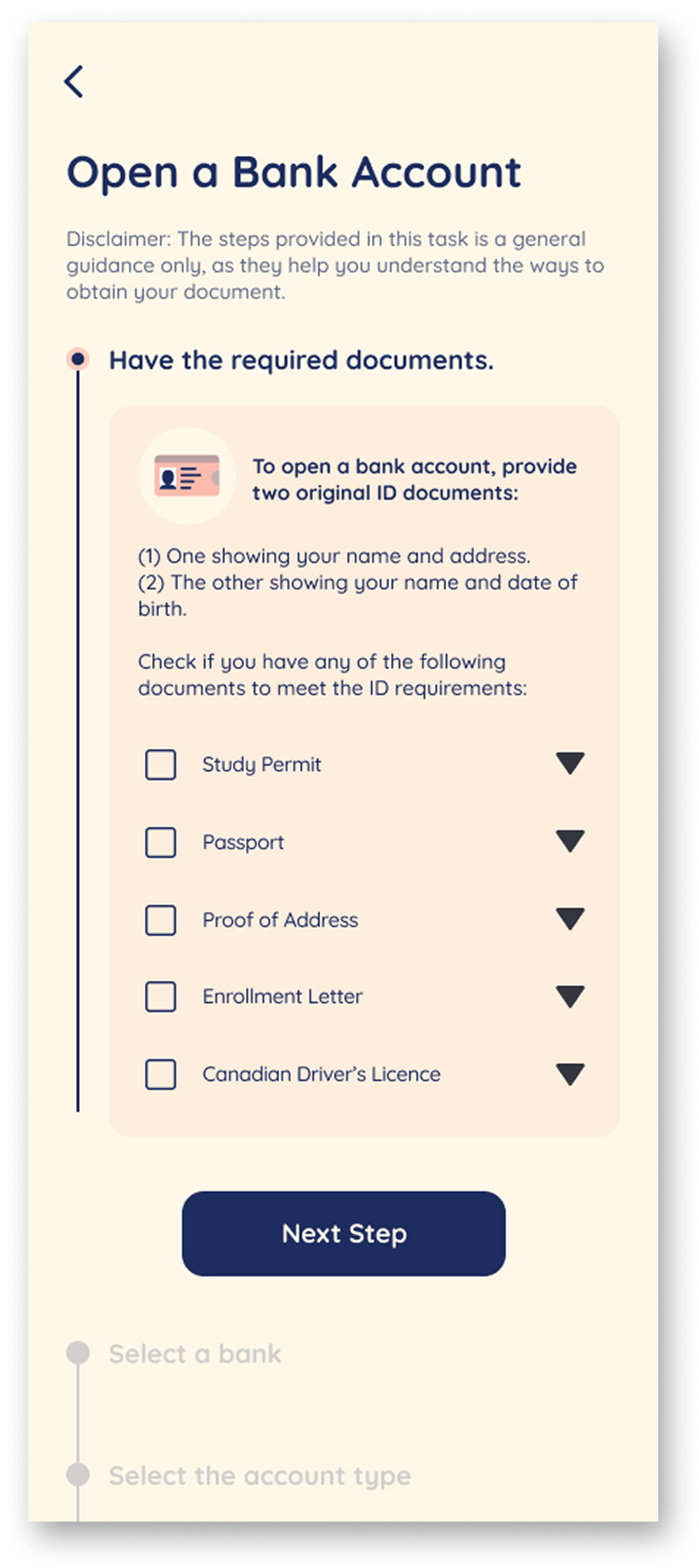
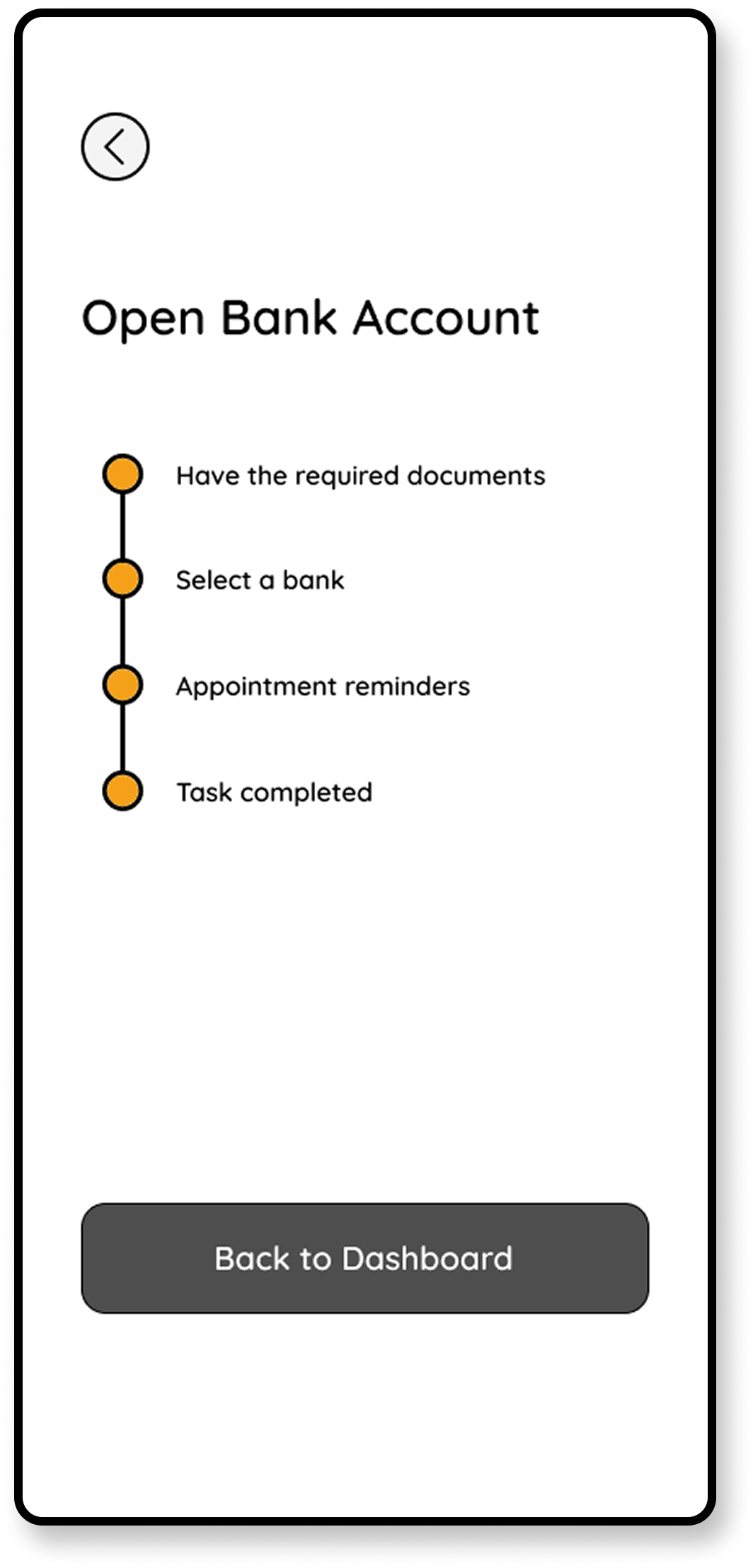
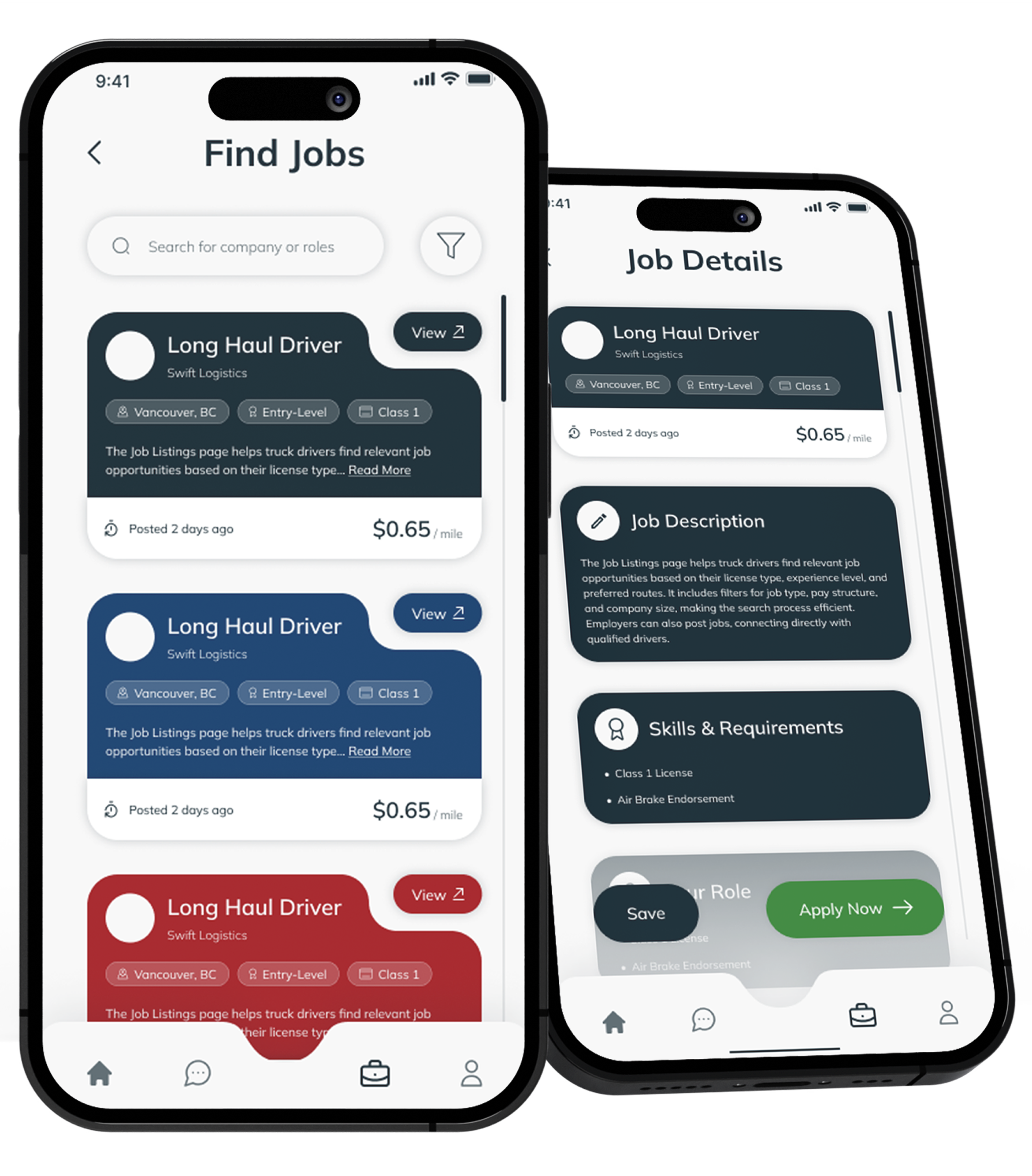
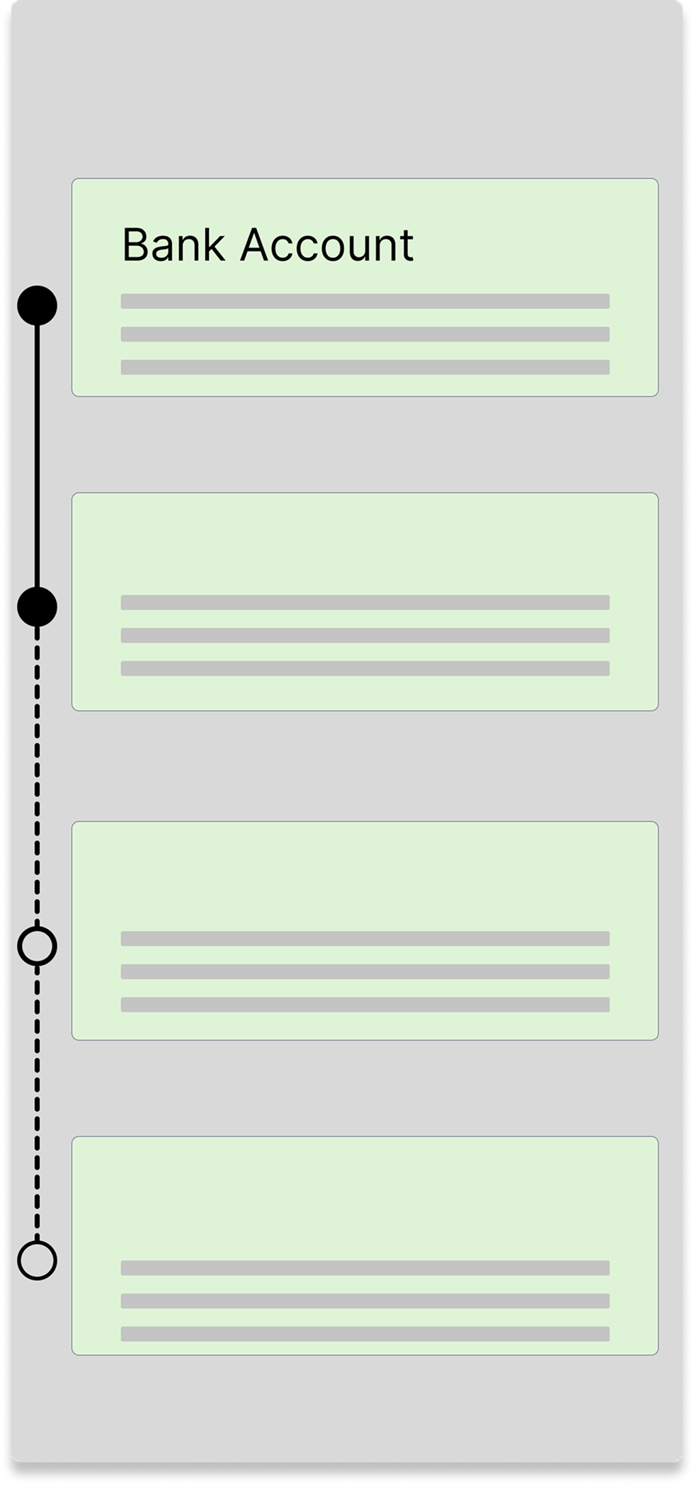
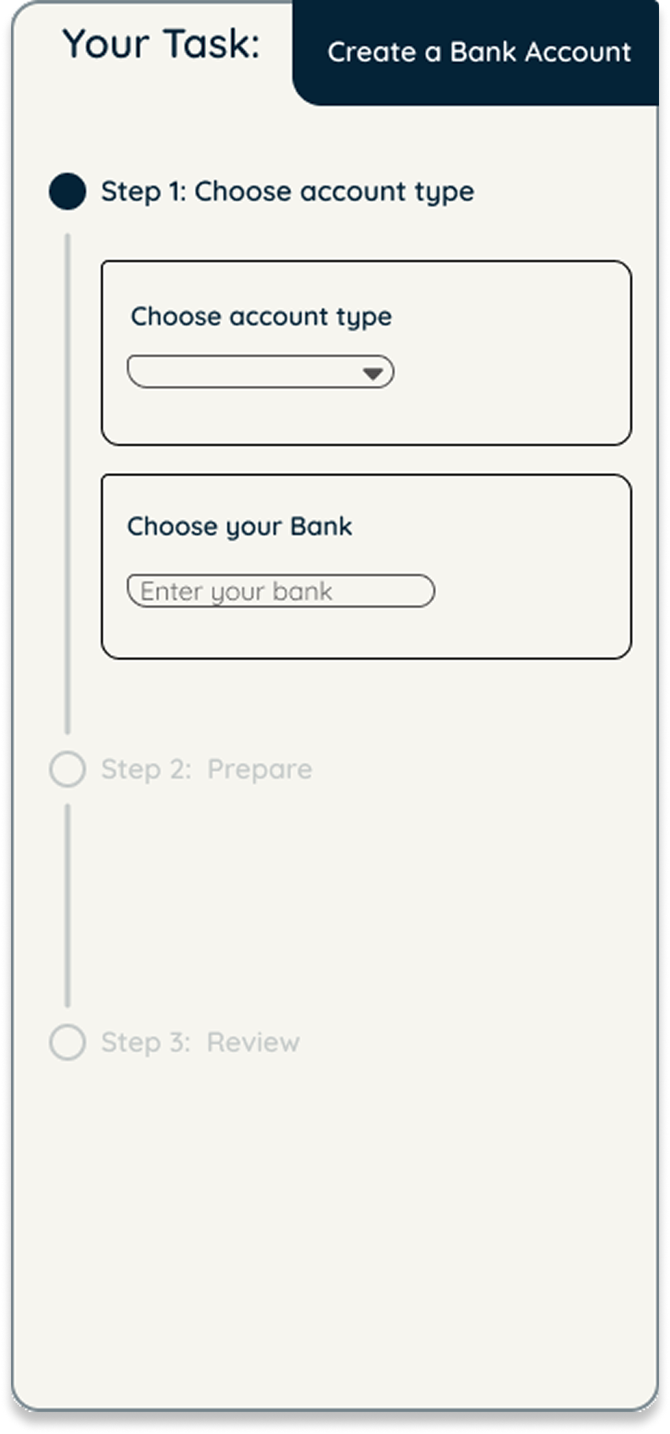
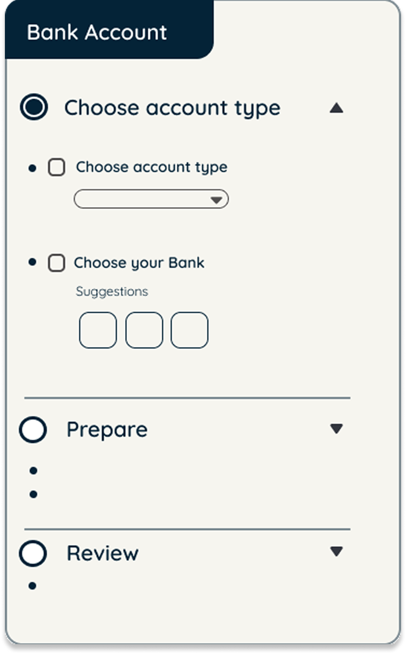
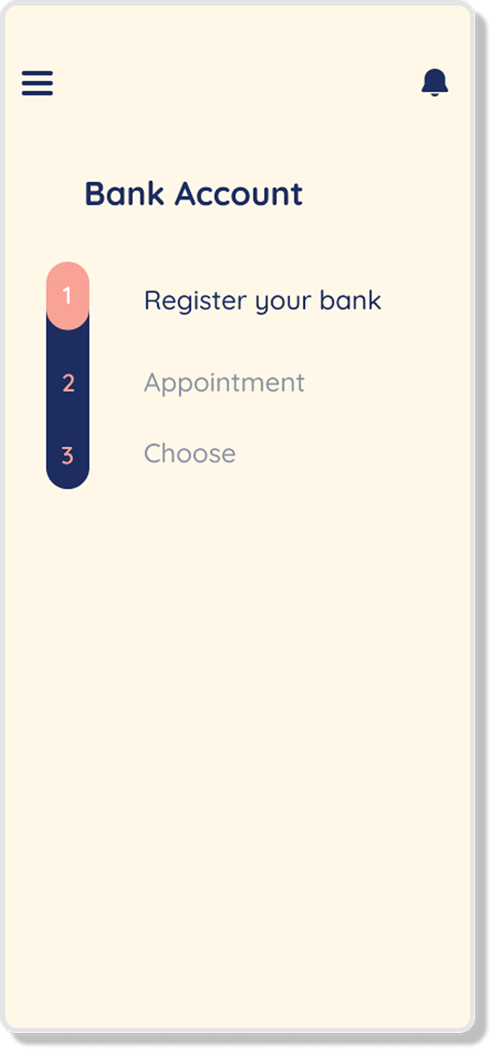
Micro-tasks reduce overwhelm.
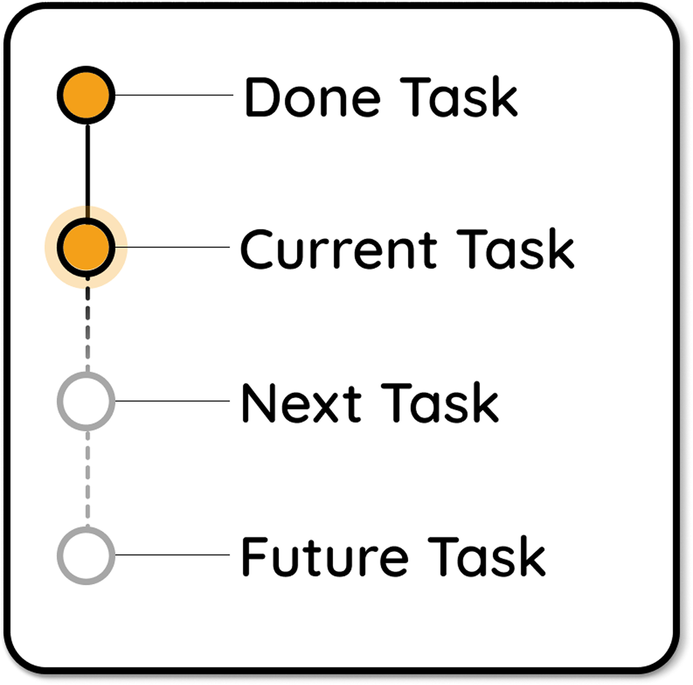
The app breaks complex processes into simple steps, with clear progress indicators and visual guidance at each stage.
Validated with real users.
12 international students tested the app over 2 weeks. The results exceeded expectations. 11/12 Users satisfied.
Breaking complex tasks into smaller steps transforms the experience. I wish this existed when I was navigating these processes myself.
Growing as a designer.
This project taught me the value of walking in the footsteps of others. By putting myself in the shoes of international students, I learned how to see problems from their perspective and translate real-world struggles into digital solutions. Leading the team with a strategic approach gave me confidence in balancing vision with execution, and it strengthened my ability to guide a project toward a clear goal. More than anything, I grew as a designer who creates not just for usability, but for empathy and impact.